Create a Simple Responsive GridView with Flutter

I love programming and I work as a Software Engineer developing web based applications and mobile apps. I'm a full stack developer, from the backend where I primarly use Node.js and MySQL on Linux Servers to the frontend where I use modern web technologies and CSS frameworks. I love to develop mobile app, especially in Android mainly in Java, and in the last year I'm using Flutter, first to experiment and in the last period to develop cross platform enterprise apps. In my spare time I like to experiment on side projects apps, ui designs, web app to improve my skills and test new ideas.
In this post, I want to guide you in a Simple Flutter App by making a responsive GridView. This is useful because now Flutter supports web apps and make a responsive UI a must-have in the web world. This article is in the series Simple Flutter Apps where I want to show how to code some simple apps in Flutter to help you get started.
What we will build
We build a simple flutter app to implement a responsive GridView using an awesome package by Romain Rastel @lets4r called flutter_staggered_grid_view, a staggered grid view which supports multiple columns with rows of varying sizes. By making this app we will learn:
- display different layouts based on the screen size;
- use a very well know package in the Flutter world;
- make a simple card UI layout like Pinterest.
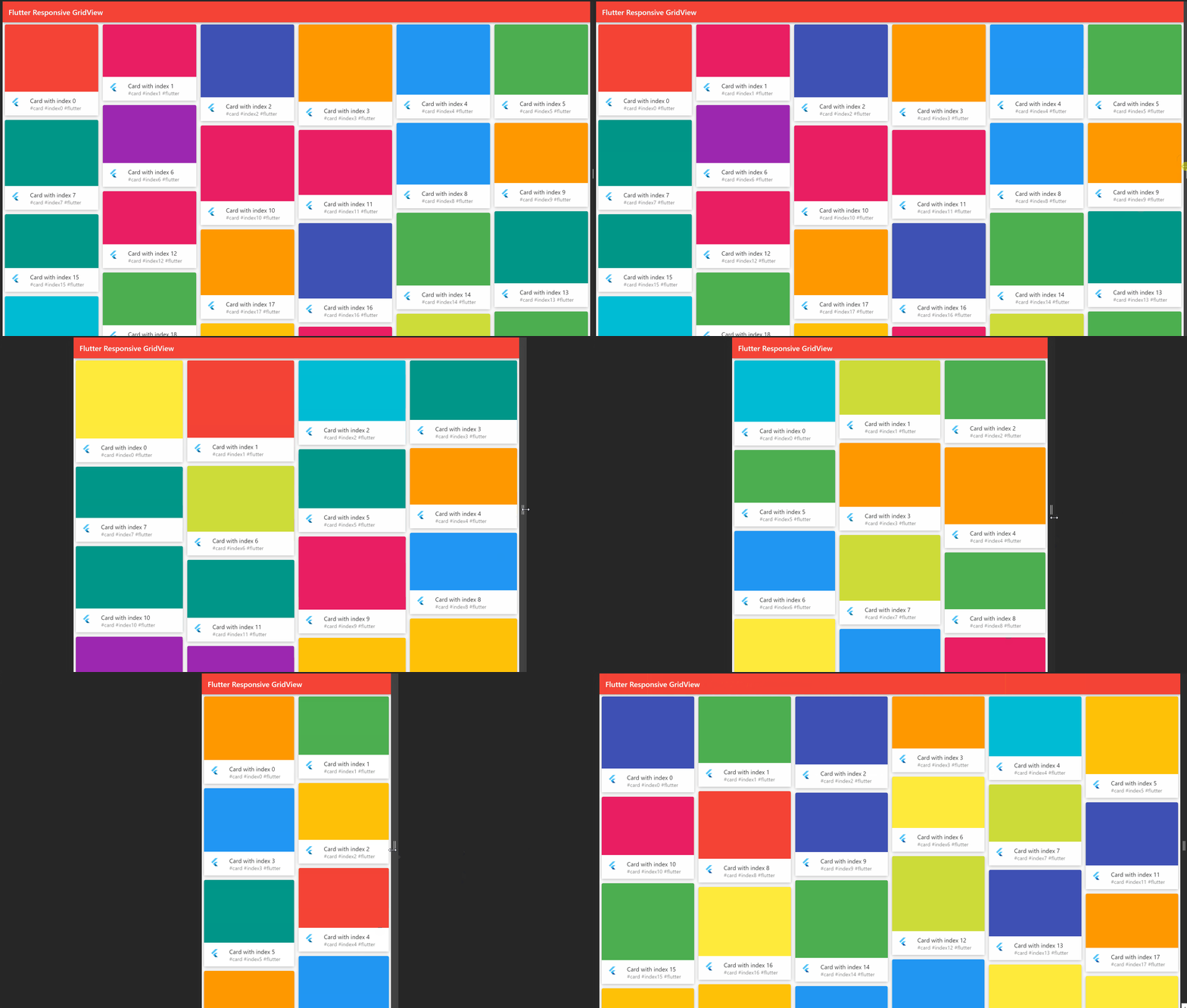
The final result in different screen sizes will be:

Let's code
First of all, we have to import the flutter_staggered_grid_view package so we have to include it in the pubspec.yaml
dependencies:
  ...
  flutter_staggered_grid_view: ^0.4.0
After that to implement a responsive layout we have to use a LayoutBuilder that builds a widget tree that depends on the parent widget's size, so we can define a set of widths, and based on them we can change the UI. Let's first define the widths
const kMobileBreakpoint = 576;
const kTabletBreakpoint = 1024;
const kDesktopBreakPoint = 1366;
then we can set up our LayoutBuilder like this
LayoutBuilder(
  builder: (context, dimens) {
    if (dimens.maxWidth <= kMobileBreakpoint) {
      return CustomGridView(columnRatio: 6,);
    } else if (dimens.maxWidth > kMobileBreakpoint &&
        dimens.maxWidth <= kTabletBreakpoint) {
      return CustomGridView(columnRatio: 4,);
    } else if (dimens.maxWidth > kTabletBreakpoint &&
        dimens.maxWidth <= kDesktopBreakPoint) {
      return CustomGridView(columnRatio: 3,);
    } else {
      return CustomGridView(columnRatio: 2);
    }
  },
)
in this way, if the width of the screen is <= kMobileBreakpoint we'll show the CustomGridView widget with a columnRatio of 6 and so on.... but what does the columnRatio variable mean?
This is a way I found to make the UI responsive based on the characteristics of the flutter_staggered_grid_view library and the way many web libraries think for defining the number of columns based on the screen size, the widget I used is StaggeredGridView.countBuilder which allows you to define two properties to structure the layout and the number of columns it has, in particular, the two properties have more or less this meaning:
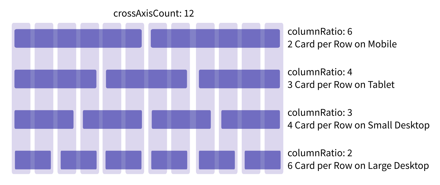
- crossAxisCount: the number of columns in the cross axis. If the scroll is from top to bottom, and vice versa (vertical scroll) the cross axis is the horizonal one. The axis in which the scroll movement takes place is called main axis, therefore the perpendicular one is called cross axis;
- StaggeredTile.fit(columnRatio): number of columns that content can expand to be represented in the layout.
By taking advantage of these two properties, the layout can be organized in this way according to the size of the screen

Once we have organized the layout of the columns, to simulate a Pinterest card, we just need to create a layout and for simplicity put a random color in the upper part based on a previously set color array
Container(
  decoration: BoxDecoration(
    color: _myColorList[random.nextInt(_myColorList.length)],
    borderRadius: BorderRadius.circular(4),
    boxShadow: const[
      BoxShadow(
        color: Colors.black26,
        offset: Offset(0,2),
        blurRadius: 6
      )
    ]
  ),
  height: random.nextInt(75).toDouble() + 200,
  margin: EdgeInsets.symmetric(horizontal: 6, vertical: 6),
  child: Column(children: [
    Expanded(
      child: Container(),
    ),
    Container(
      color: Colors.white,
      child: ListTile(
        leading: FlutterLogo(),
        title: Text("Card with index $index"),
        subtitle: Text("#card #index$index #flutter"),
      ),
    )
  ]),
)
The result is something like this

How to improve it
You can look inside the code of the flutter_staggered_grid_view library and see other option to experiment with, some hints are:
- Customize the look and feel of the single card;
- Insert an image in the top part of the card, maybe grab it from services like Pexels or Unsplash;
- Manage device orientation on Android and iOS.
You can find the source code in this GitHub repo: simple-flutter-gridview, you can fork, use and modify it as you want, the app uses the latest Flutter 2.2 so it's already with Sound Null Safety, you can build it on Android, iOS and on the Web.
Bye, Alberto


