Become a better designer by developing Flutter Apps
I love programming and I work as a Software Engineer developing web based applications and mobile apps. I'm a full stack developer, from the backend where I primarly use Node.js and MySQL on Linux Servers to the frontend where I use modern web technologies and CSS frameworks. I love to develop mobile app, especially in Android mainly in Java, and in the last year I'm using Flutter, first to experiment and in the last period to develop cross platform enterprise apps. In my spare time I like to experiment on side projects apps, ui designs, web app to improve my skills and test new ideas.
In this article, I want to deepen a talk related to Flutter Engage held by @filiphracek, where he presents some ideas for developing beautiful Flutter applications.
We all know that the concept of beauty is subjective, but some tricks can be used to improve the look and feel of our apps and are quite simple to implement. Let's see them together!
White Space
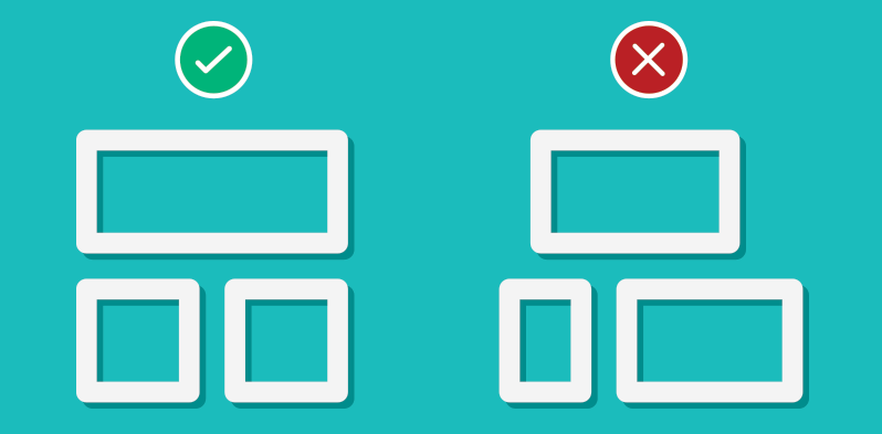
This is the first important concept that you have to keep in mind when you develop your app. White space is the space between elements that lets them stand out. Trying to fit as much stuff as possible on the screen is often not a good idea because it can make the content difficult to read and make the user lose in the flood of information that is given altogether.
Through the correct use of the spaces between elements, it is possible to communicate what the hierarchy is and therefore the importance or the relationship between elements. The easiest way to implement this first suggestion is through the use of Padding which allows giving space and air between different elements of our interface. In combination with padding, you should make good use of alignments to communicate even more than elements are related to each other, a very common case is to align the title with the paragraph that corresponds to it so that visually the user can correlate them.
Typography
Another very important concept, especially in those apps that contain a lot of text, is typography. Within your app, fonts, and styles you use can give you a great hand in communicating what are the most important elements and what their function is.
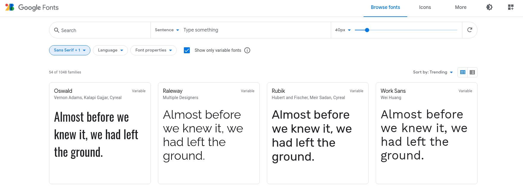
A rule that always works is: limit the number of fonts to a minimum, the best would be to use only one family and play with its styles instead: bold, italic, medium, thin. In Flutter there's the google_fonts package to quickly use Google Fonts in your app and play around with fonts until you find the one that best suits your needs, but remembers: less is more.
Color
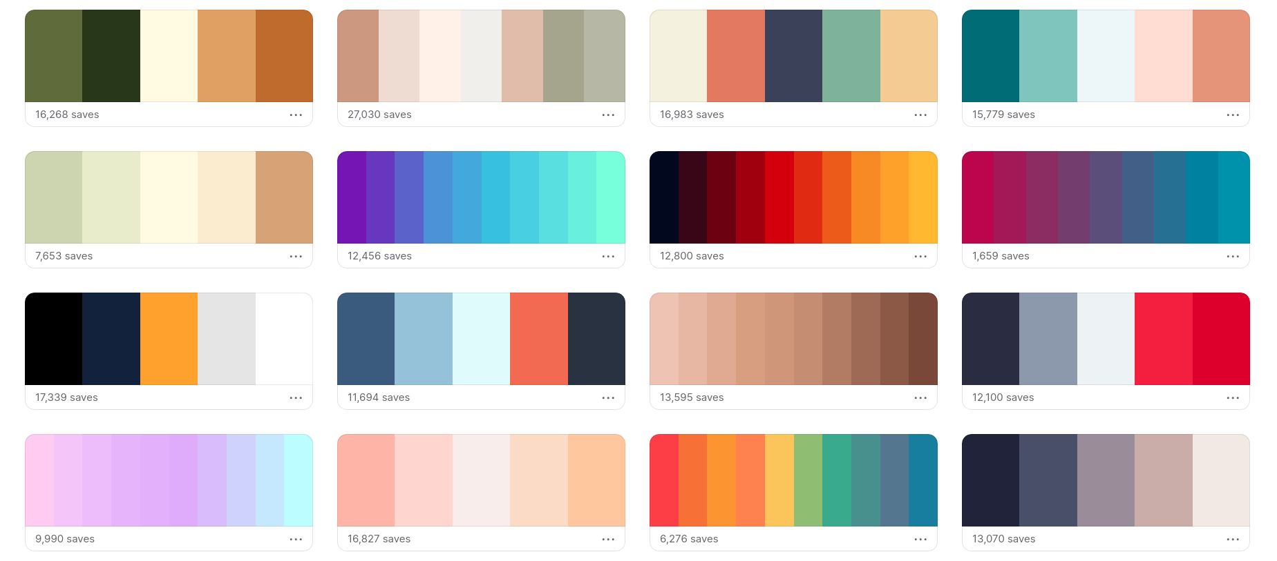
You can get a lot in an app using the right combination of colors, certainly, it is not always easy to find the right one but you can always get help from the many online tools that provide already "effective" and beautiful to look at color palettes that we can use to improve the look and feel of your app.
Some of these tools such as Coolors allow you to start from an image and extract the corresponding palette, Picular instead starting from keywords gives you the colors that correspond to it, and finally, ColorSpace allows you to generate a color palette from a starting key color, such as the color of your brand.
Once you have chosen the color palette that's right for you, Flutter provides you the ThemeData class with which you can define the style of your app, use it and make it consistent across all screens and elements.
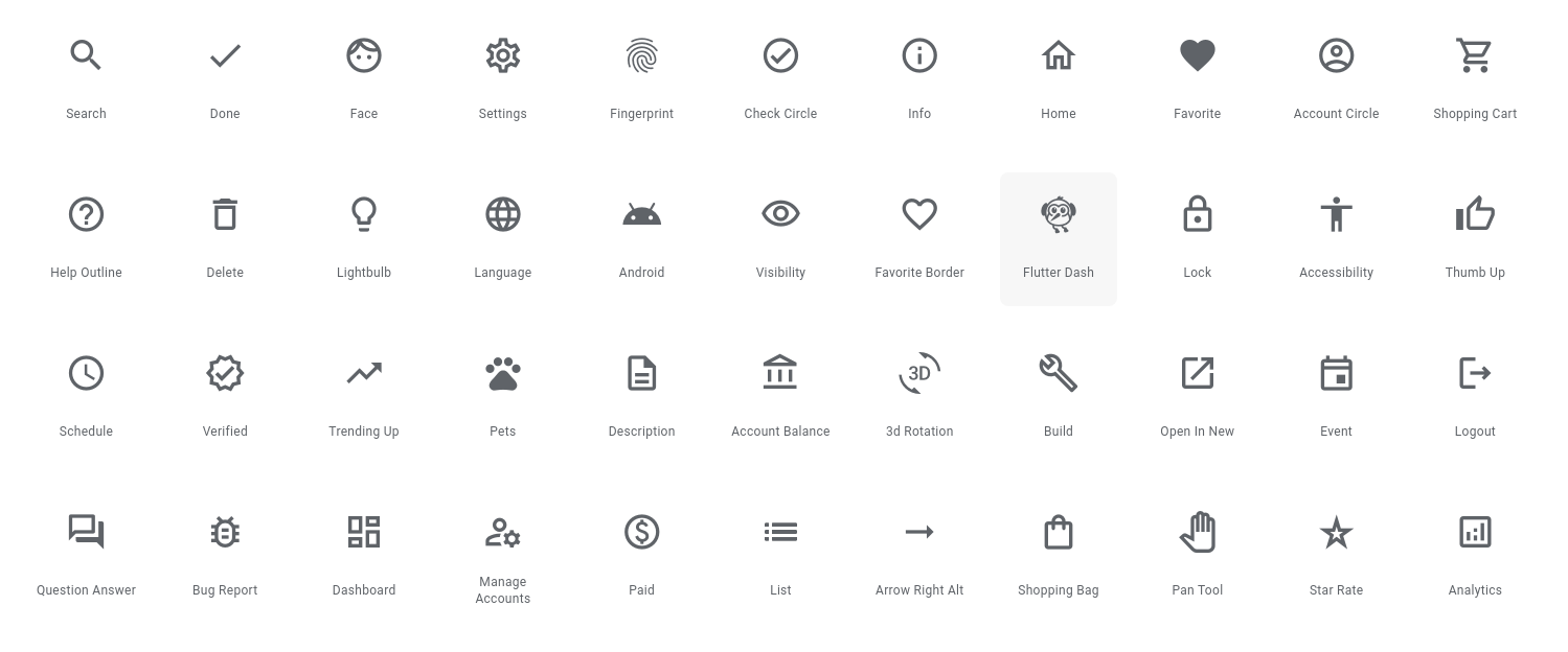
Iconography
Sometimes a picture can say a thousand words, and a picture placed in the right place can do even more. Proper use of icons, images, and graphics can make a huge difference and turn a boring app into a great one.
Flutter provides many classes and packages to work with images, to download them efficiently from the web like cached_network_image, and to apply a customized icon package: font_awesome_flutter, fluentui_system_icons just to name a few.
As mentioned in the case of fonts, if you choose to use a custom icon pack, limit yourself to using only one, in order to keep the style consistent within your app.
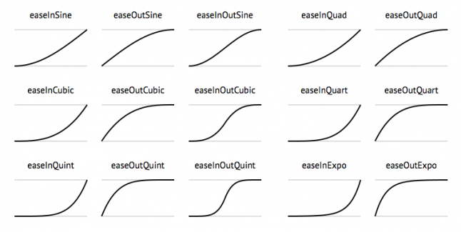
Animation
This is perhaps the most advanced point of all because with animations it is possible to relate and give life to the elements that are in our apps. Correct use of animations can guide the user within the app, make him naturally switch from one screen to another, or give him feedback on what just happened.
A very easy component to implement in our apps but which can make a big difference is Hero class with which a component can literally switch between screens continuously. Flutter also allows you to customize the transitions with speed, directions, rotations, leaving you free to customize the interface as you want, even in this case, however, it is always better not to overdo the applied effects too much so as not to make your users seasick.
Conclusion
In this article, we have seen some very important concepts that can be used within our apps to make them more beautiful and improve the user experience. A package that I can recommend and that can give you a big hand in implementing many customizations of your layouts is Pawan Kumar's VelocityX of which I wrote an article a few months ago. So with everything we learned today let's make our Flutter apps beautiful!
Bye, Alberto.